Studio Onda
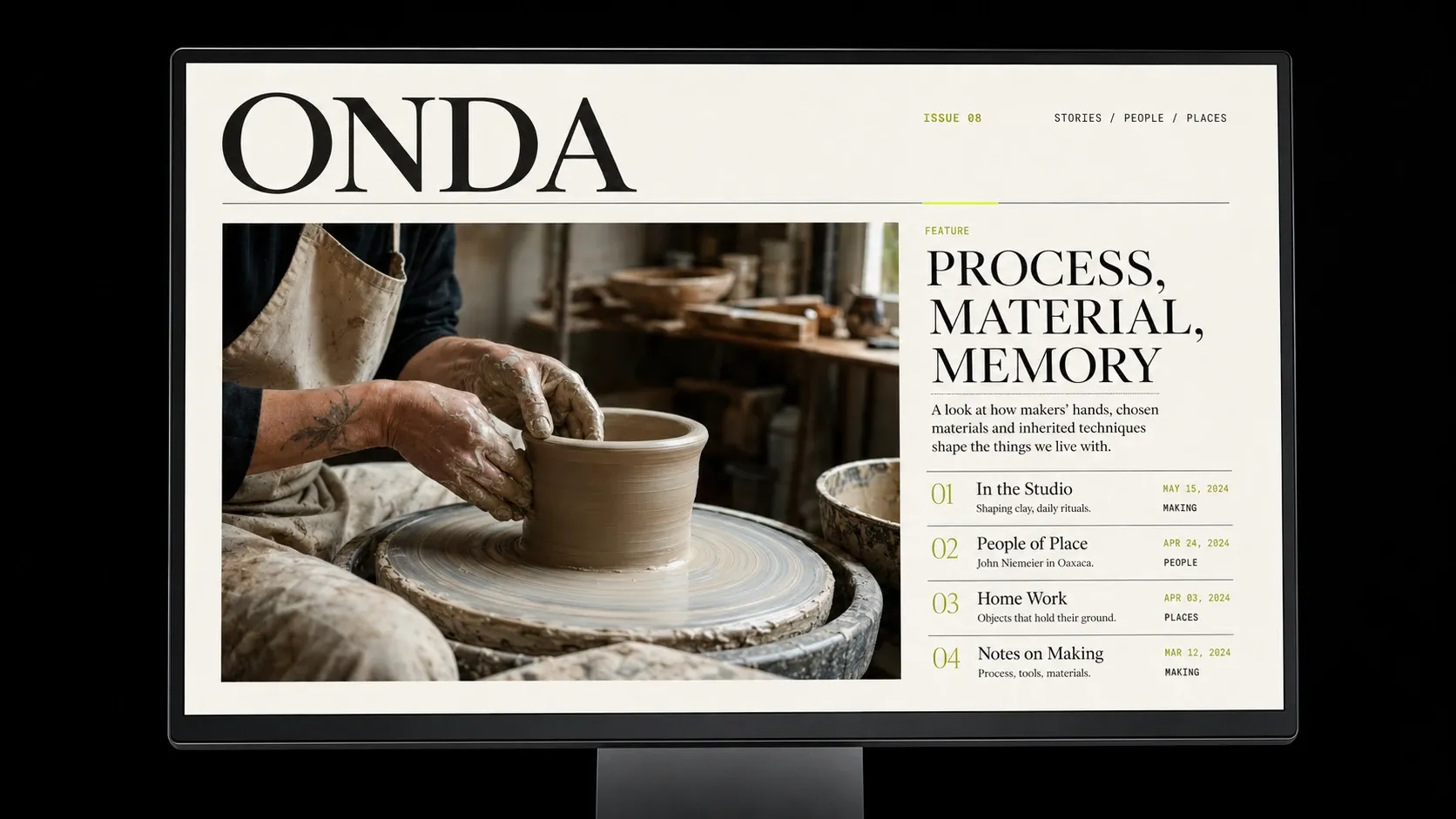
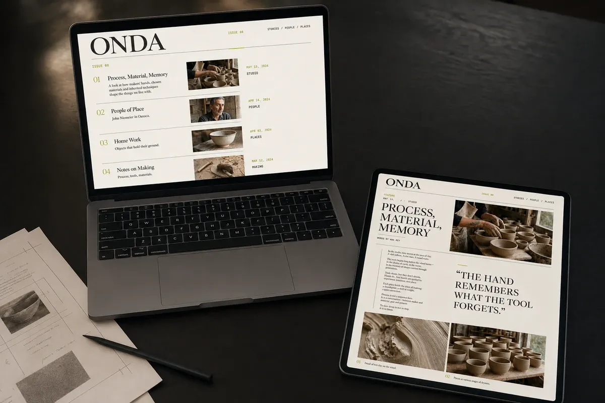
Studio Onda publishes stories about design, culture, and the people shaping both. Its archive had grown quickly; the website had not. Essays, interviews, and visual stories were forced through the same narrow template, making every piece feel equal in length, weight, and importance. The brief was a site that could change pace from story to story without losing the voice of the publication.
We designed around reading modes rather than fixed page templates. Essays hold a narrow measure and open slowly. Interviews make the exchange visible. Portfolios let images take over, then return the reader to context with short, precise captions. The grid stays consistent underneath; what changes is the rhythm above it.
The rule was simple: structure should guide the story, not flatten it. A compact type scale, modular image widths, and repeatable metadata give editors enough freedom to compose without turning every release into a redesign.
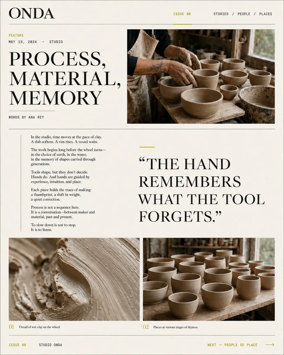
“A publishing system should change pace without changing character.”
| Mode | Lead | Reading measure | Image rhythm |
|---|---|---|---|
| ESSAY | Title + standfirst | Narrow | Measured breaks |
| INTERVIEW | Speaker exchange | Medium | Inline portraits |
| PORTFOLIO | Full-width image | Minimal | Image-led sequence |
| NOTE | Date + subject | Compact | Single supporting frame |
The finished site turned a growing archive into a clear editorial point of view. Studio Onda can now publish a short dispatch, a long interview, or an image-led feature without forcing them to behave alike. Readers move through the work with less friction; editors have a system that supports judgment instead of replacing it.