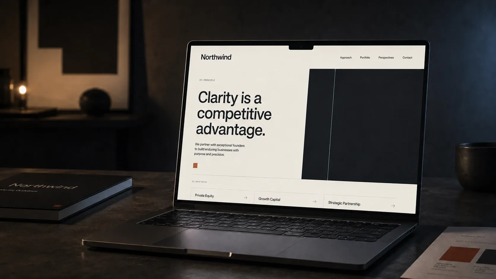
Northwind

Northwind is a boutique investment firm that wanted to feel less like a bank and more like a design studio. They were winning sophisticated clients while presenting like a commodity — cautious, generic, easy to forget. The brief was simple to say and hard to do: look as considered as the advice they give.
The work started with language, not logo. We distilled Northwind’s promise into a single principle — clarity is a competitive advantage — and let it govern every decision that followed: what to keep, what to cut, and how much to say. The guidelines below set the rules the rest of the system plays by.
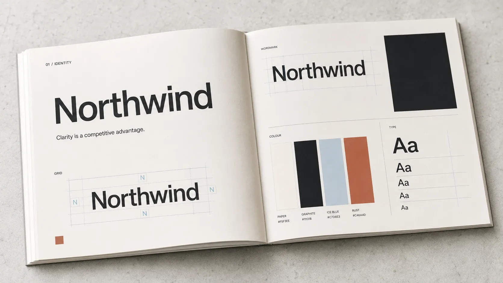
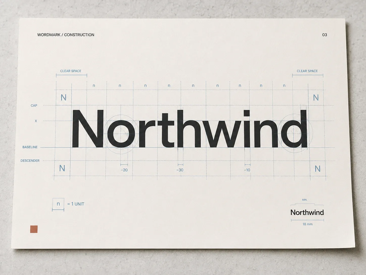
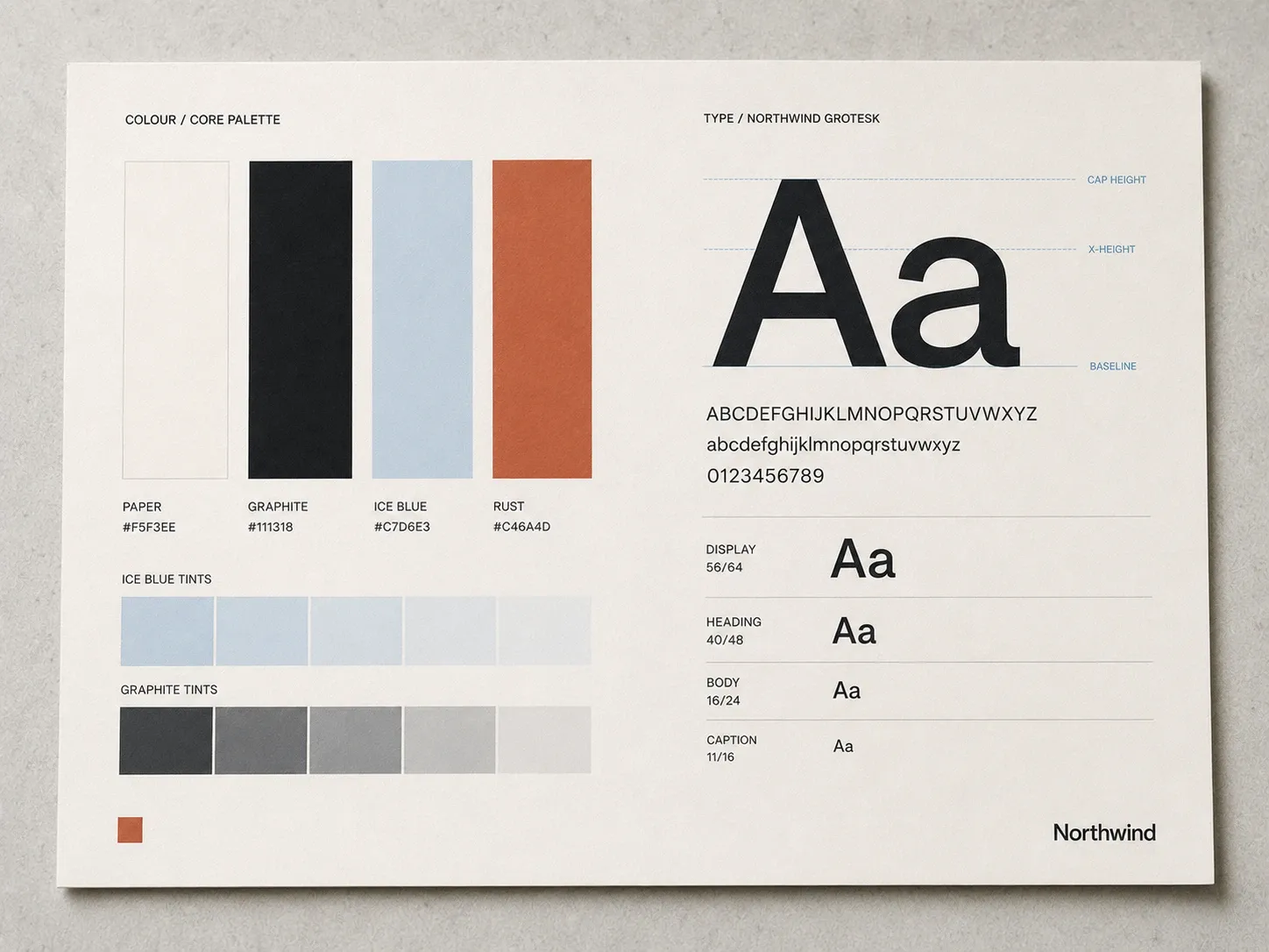
A single confident wordmark anchors the identity, drawn on a strict construction grid so it holds together at any scale. A restrained palette and a disciplined type system carry the rest — the brand stays unmistakably itself from a business card to a boardroom deck.
“They gave us a brand that finally looks like how we think.
”
Launched in three weeks, the new identity gave Northwind a presence that finally matches the room. The website does the introductions before a single word is spoken — and the numbers followed.